When the Brief is Personal
A complete brand identity for a charity built around three foster children — where every design decision was grounded in the real story behind the organization, not just its mission statement.
THE BRIEF
JoyBox Foster Closet partners with the community to provide clothing, gear, and comfort items to children in foster care and the families who support them. The founder — a friend — came to me not with a creative brief but with a personal story: three foster children, a mission built around restoring dignity, and an organization that needed a brand to match the depth of what it was doing.
This wasn't a brief about aesthetics. It was about making a family feel seen in a logo.
THE DECISIONS
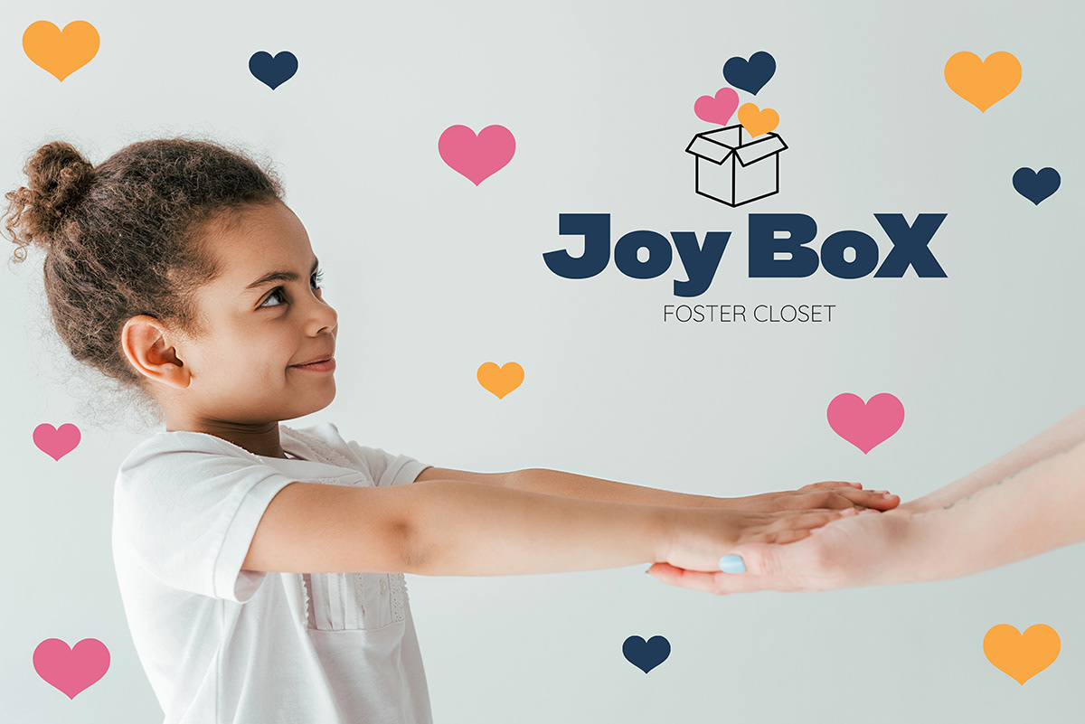
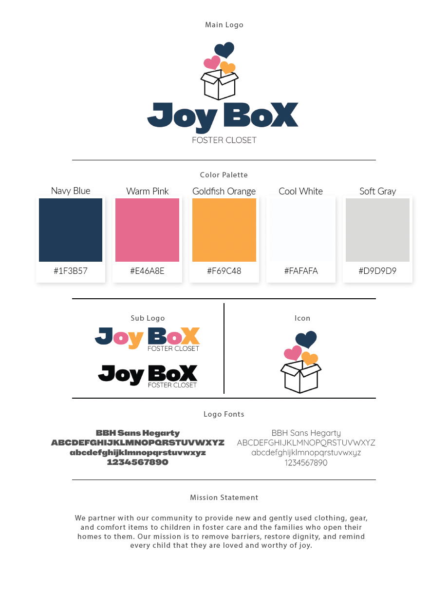
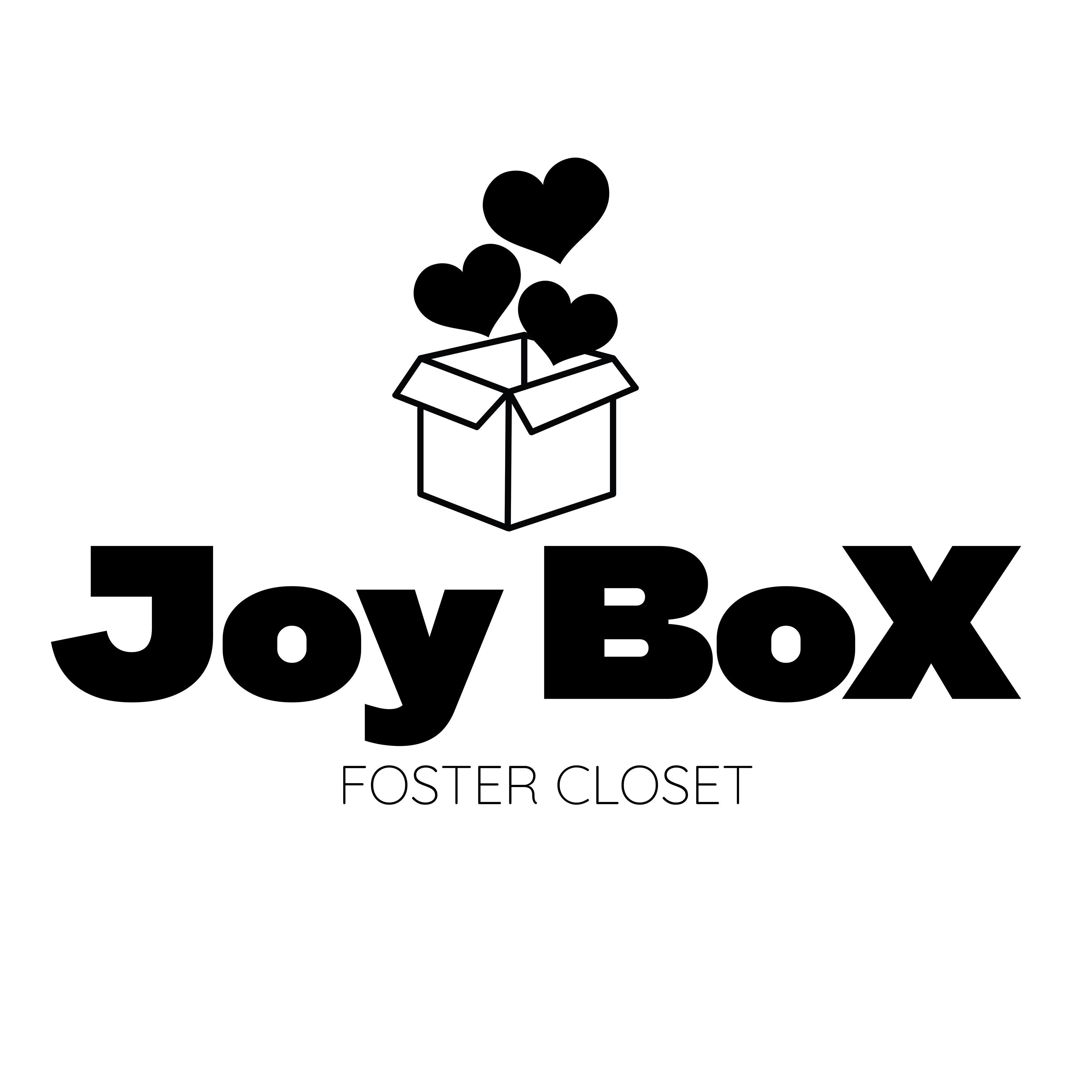
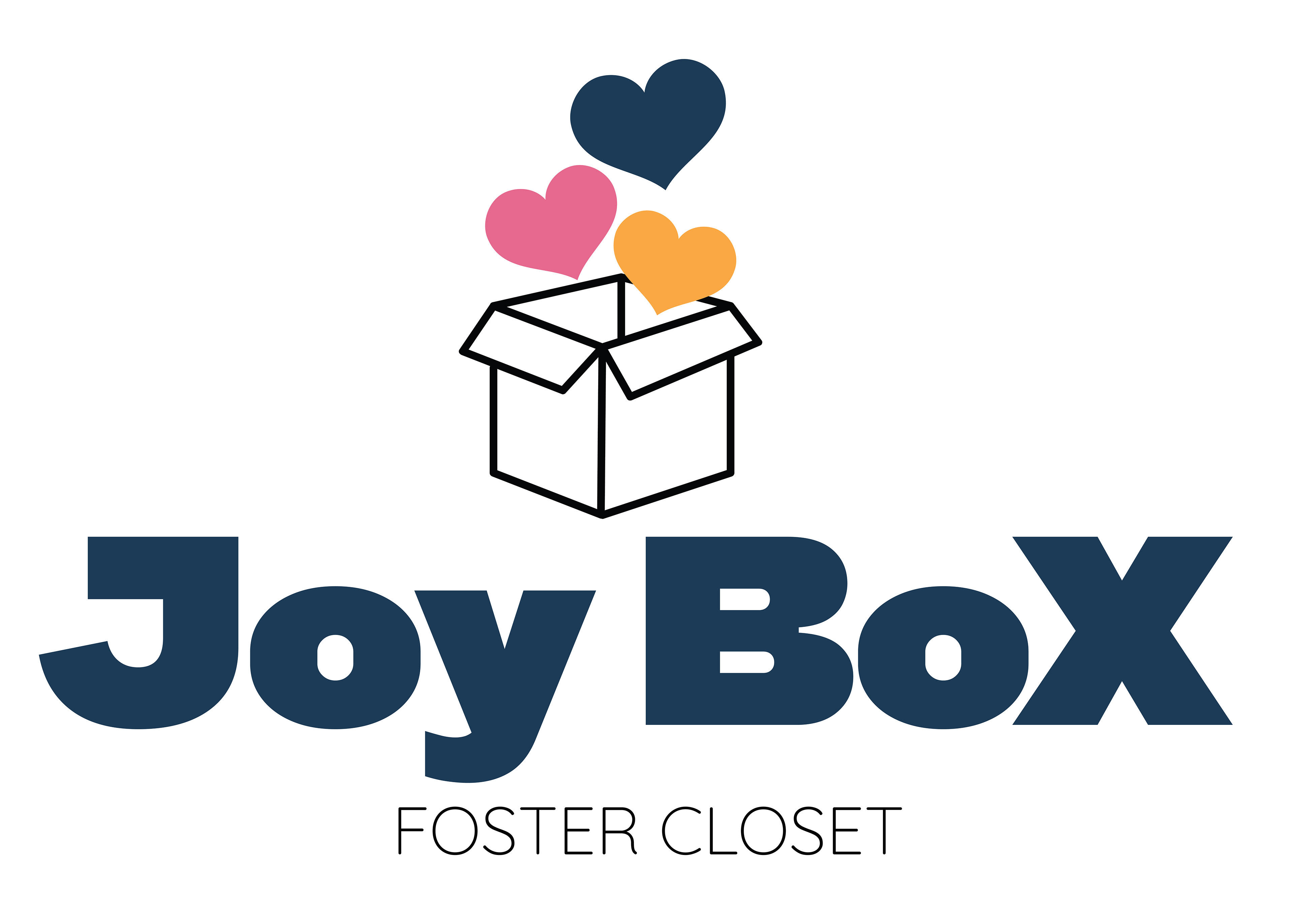
The three hearts in the logo aren't decorative — they represent the founder's three foster children. The color palette wasn't pulled from a trend board or brand psychology framework. It came directly from the children's favorite colors. Every element of the identity is grounded in something real.
The open box is the organizing metaphor: something arriving, something being given, something full of possibility. Combined with hearts floating upward, it reads as both the literal act of donation and the emotional experience of receiving care. Warm and immediate without being sentimental or clichéd.
The typography balances approachability with confidence — this is an organization doing serious work for vulnerable children, and the brand needed to feel trustworthy to foster families, caseworkers, and donors simultaneously.
THE OUTCOME
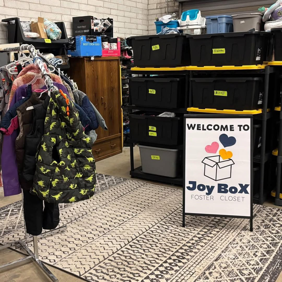
The identity system was designed to work across print, digital, and physical environments — from signage in the closet space to social media to printed materials. The welcome sign is currently in use inside the JoyBox location in Monroe, Michigan, greeting the families and children the organization exists to serve.
Some projects are client work. This one was a responsibility. The brand needed to be worthy of the story behind it — and the children at the center of it.

BRAND APPLICATION
The identity system was designed for flexibility across physical and digital environments, ensuring consistency from printed materials to in-space signage. Emphasis was placed on clarity, warmth, and immediate recognition to support both volunteers and families interacting with the organization.