
Accessible Document Systems
Developed structured, accessible documents designed for screen readers and assistive technologies. Focused on logical reading order, clear labeling, and consistent field naming to improve usability and reduce confusion for users relying on accessible formats. Includes experience with 508 compliance and accessibility remediation workflows.

Designing for accessibility ensures content is usable for individuals relying on assistive technologies such as screen readers and braille displays.
Accessibility Remediation Process
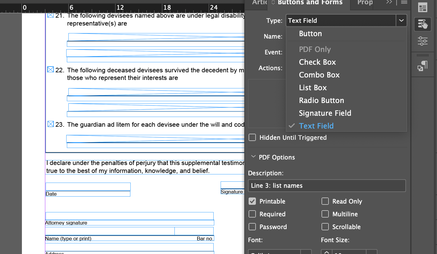
Structured Form Fields
Uses clear naming and descriptions to support usability.
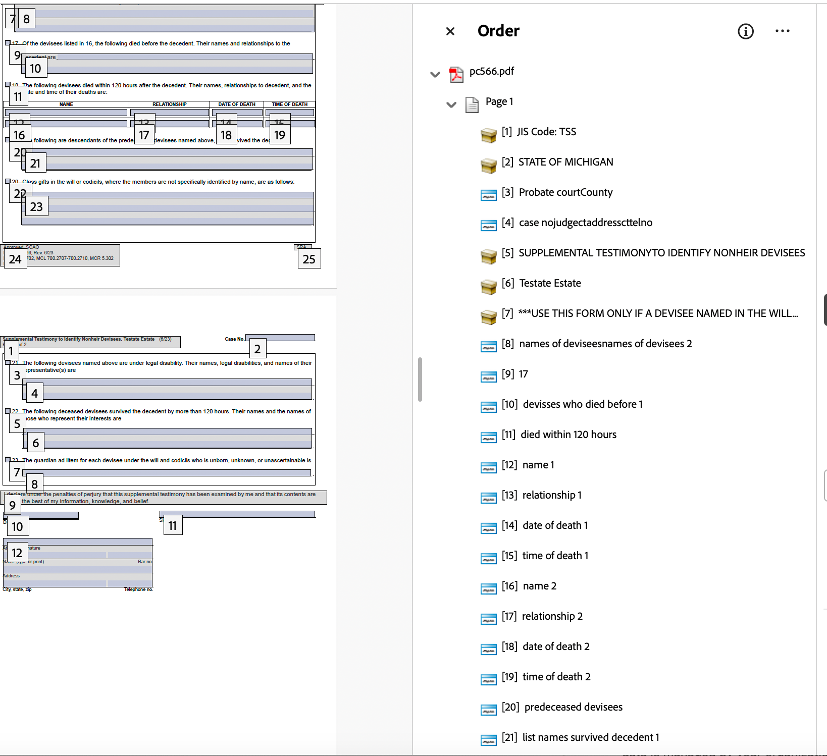
Logical Reading Order
Defines the logical flow of information for assistive technologies.
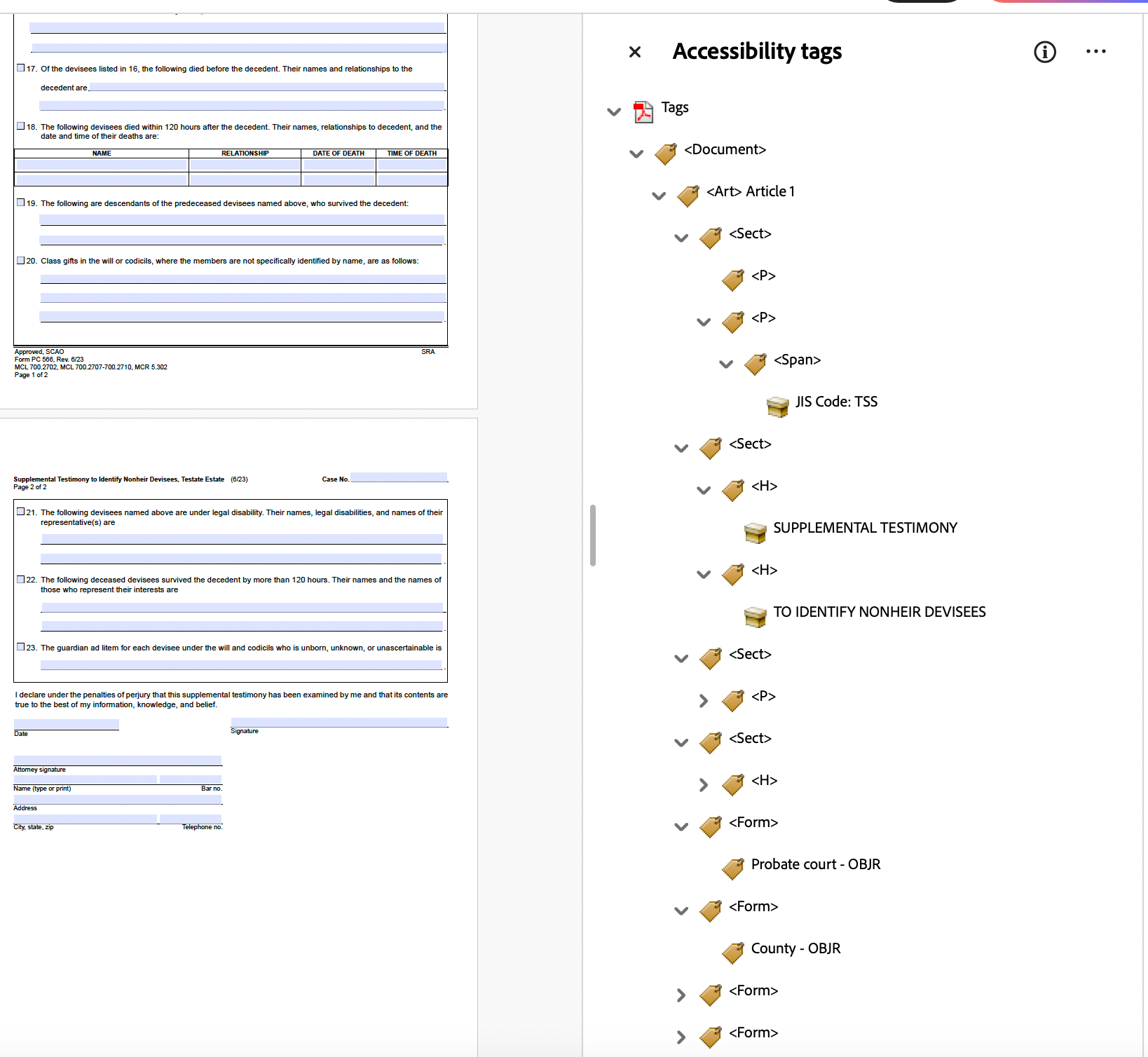
Tagging and Document Structure
Ensures content is correctly interpreted by screen readers.
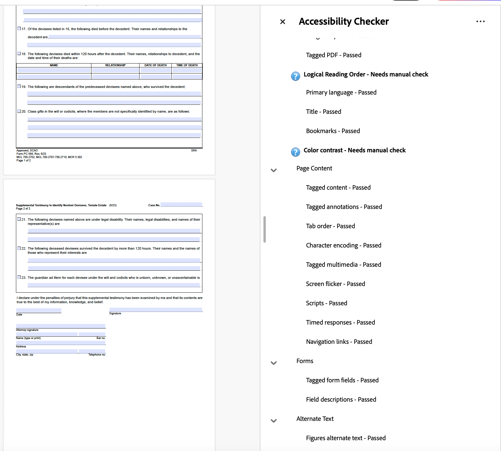
Accessibility Check
Verifies compliance and identifies usability issues.
Why It Matters
Accessibility is not just a requirement—it directly impacts how users interact with content. Proper structure ensures information is read in the correct order, form fields are understandable, and documents are usable for all audiences.
Accessible Design in Practice
Accessibility is not only about remediation—it begins at the design stage. These examples demonstrate how visual decisions such as color contrast, typography, and layout contribute to usability and inclusivity from the start.
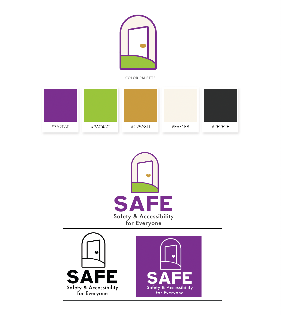
Color & Contrast Considerations
SAFE’s color palette was intentionally developed using WCAG 2.1 contrast standards to ensure readability across both print and digital applications. The system balances warmth and advocacy with technical accessibility requirements, supporting inclusive communication and reducing visual strain for a wide range of users.
Typography & Clarity
Typography was intentionally selected to support accessibility, clarity, and visual hierarchy. Font styles, weights, and spacing were carefully applied to improve scanability, reduce cognitive load, and maintain consistent readability across both print and digital applications.

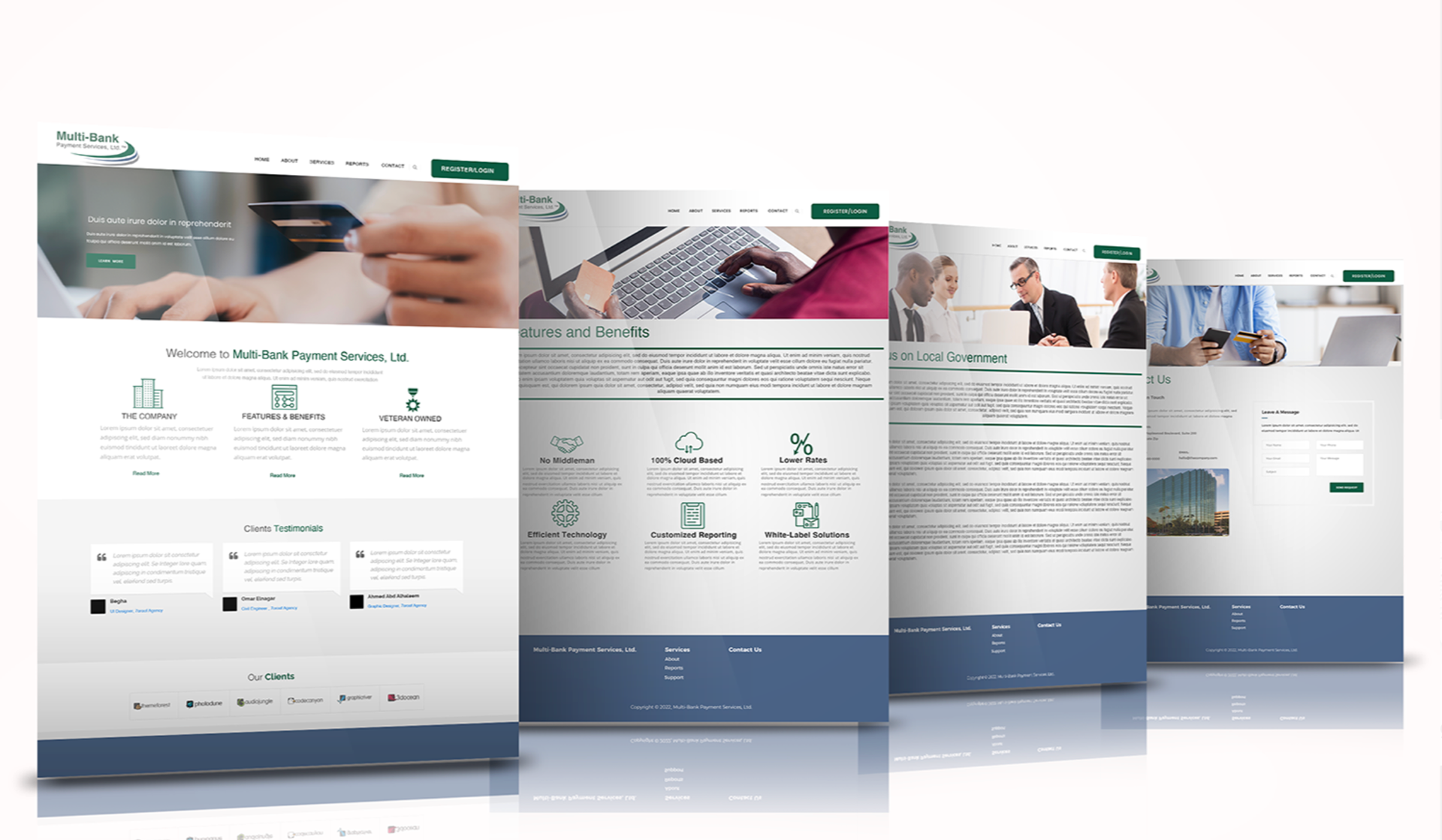
Color & Contrast in UI
Applied WCAG contrast guidelines to ensure text and interface elements remain legible across devices and lighting conditions.
Typography for Digital Readability
Selected and structured type to support hierarchy, scanability, and consistent readability across screen sizes.
Layout & Navigation
Organized content using clear hierarchy and spacing to guide users efficiently through key information and interactions.