
THE BRIEF
A new residential development needed a brand that felt premium—without defaulting to the expected “apple orchard” aesthetic of the region. Full creative freedom. No existing brand to work within.
The challenge was immediately apparent: the word "apple" carries a lot of imagery in this part of the country. The Ohio-Michigan border is apple orchard territory. The word "apple" is everywhere — and with it comes a predictable visual vocabulary of farmhouses, red fruit, rustic type, and country warmth. None of that was wrong for the region. All of it was wrong for this client.
THE STRATEGIC PROBLEM
In this region, “apple” comes with a built-in visual language:
red fruit, barns, rustic type, farmhouse charm.
red fruit, barns, rustic type, farmhouse charm.
That works—just not for this client.
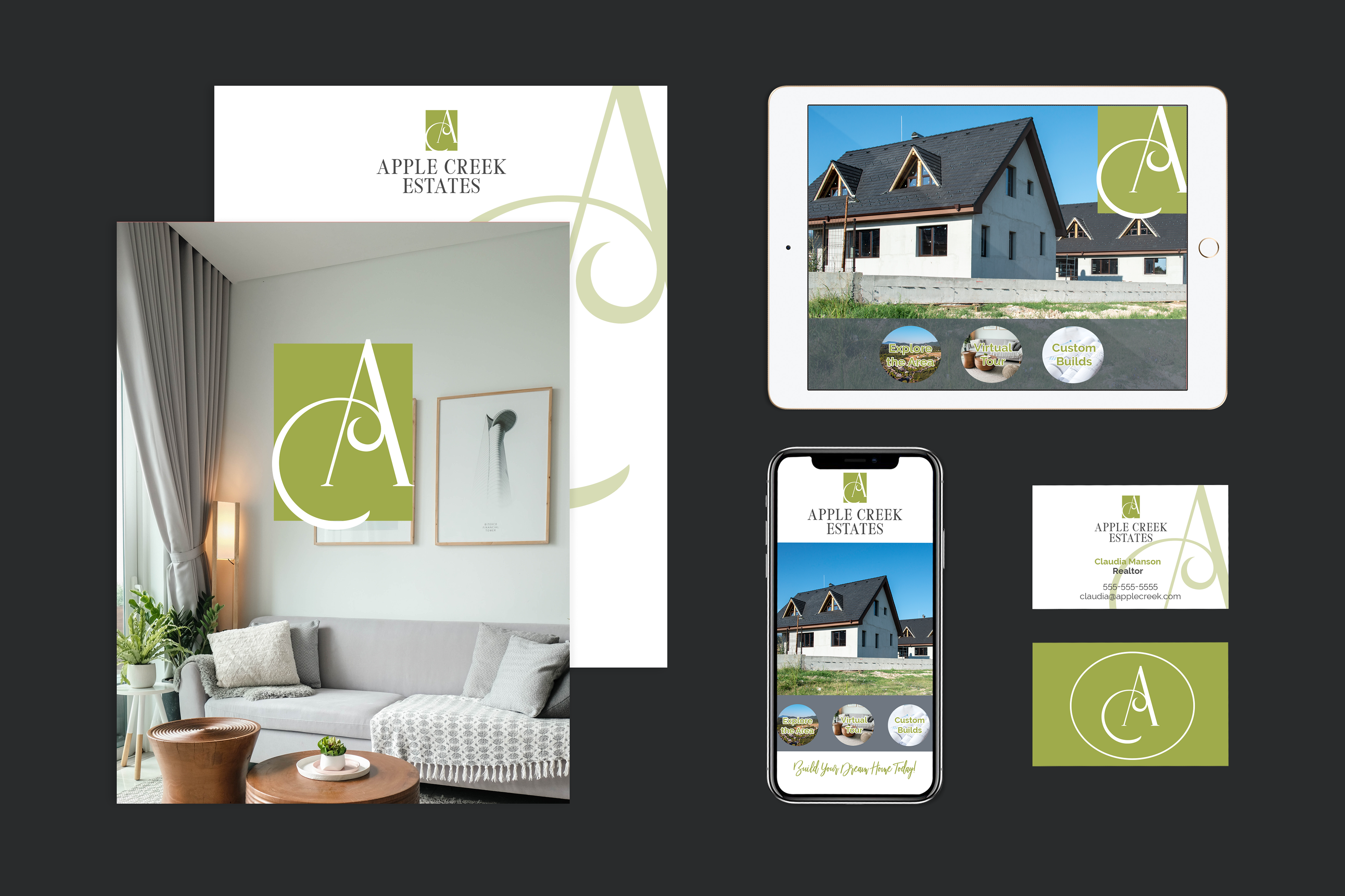
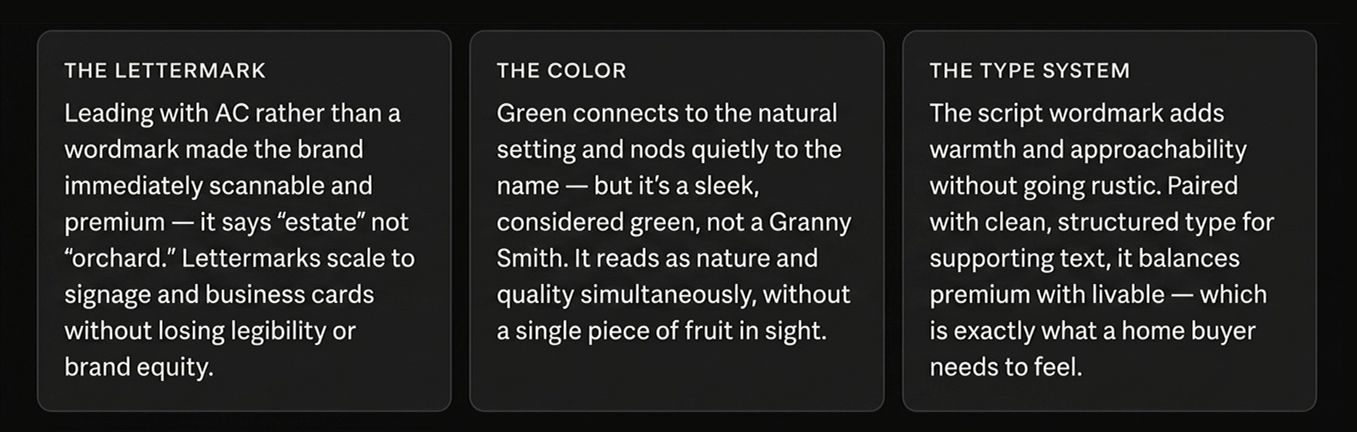
The goal wasn’t “orchard.”
It was estate.
It was estate.
THE OUTCOME
The brand was approved with minimal revisions and deployed across print, digital, and on-site signage.
The system was designed to read clearly at every scale—from roadside signage to a business card—where recognition and legibility matter most.
Apple Creek Estates remains an active development, with the identity in use today—including at the entrance signage I pass regularly.